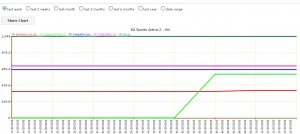
Price history charts
 Have you ever wondered how competitors’ prices are changing over the previous weeks, months, years?
Price2Spy price history chart gives you just what you need.
You can see all price and availability movements for all your competitors – for any period you select: 1 week, 2 weeks, 1 month, 3 month, 6 months, full year, or a custom date range.
Looking at the chart it is easy to distinguish which sites are leading the way, and which ones are reacting and adjusting their prices accordingly. You can also see periods when a certain product was not available on competitors’ sites, which probably means they ran out of stock.
Here are some quotes from price2SPy clients who checked price history charts for the very first time
========
Very cool. I can definitely see this being useful as we drill into history on specific items and get a better sense of how competitors are reacting. I’ll share with the team.
========
Thats a very nice function, congratulations!
========
Nice feature. I like it so far!
========
Thanks for updating me. That will be very helpful.


